atlassian-design-system 코드를 분석하여 간단한 디자인 시스템 구축하기
링크
아틀라시안 디자인 시스템 https://atlassian.design/design-system
아틀라시안 디자인 시스템 코드 저장소 https://bitbucket.org/atlassian/atlassian-frontend-mirror/src/master/design-system/
한국 디자인 시스템 가이드 https://www.krds.go.kr/html/site/index.html
에제 페이지#
개요#
한번은 디자인 시스템 구축 업무를 맡아보고 싶었으나, 여건상 기회가 닿지 않아 아쉬움이 남았습니다. 마침 좋은 참고자료가 있어 Atlassian Design System을 분석하고, 이를 토대로 직접 버튼 컴포넌트를 만들어보겠습니다.
디자인 토큰#
디자인 시스템을 코드로 구현하려면 디자인 토큰에 대한 이해가 필수입니다.
디자인 토큰(Design Tokens)은 디자인 시스템에서 반복적으로 사용되는 디자인 속성을 효율적으로 관리하기 위한 일종의 추상화된 값을 변수로 정의한 코드이다. 색상, 글자, 간격, 그림자 등과 같은 스타일의 속성을 정의하고, 이를 코드로 변환하여 디자인 시스템 전반에 걸쳐 일관된 스타일을 유지할 수 있게 도와준다. — KRDS
디자인 토큰은 UI 구성정보 및 디자인 결정을 위한 작은 데이터 단위입니다. 핵심은 Raw 값을 직접 사용하지 않고, 의미 있는 이름으로 감싸는 것입니다.
디자인 토큰 사용이유?#
CSS 변수보다는 토큰 네이밍으로 좀 더 명확한 의미를 보여줄 수 있습니다.
1/* CSS 변수만 사용 */
2.button {
3  background-color: var(--blue-500);  /* 색상이 뭘 의미하는지 알 수 없음 */
4}
5
6/* 디자인 토큰 사용 */
7.button {
8  background-color: var(--ds-background-brand-bold);  /* "브랜드 강조 배경"임을 알 수 있음 */
9}
디자인 토큰의 핵심 가치는 다음과 같습니다.
- 의미 전달: blue-500은 색상값일 뿐이지만, background-brand-bold는 용도를 명시합니다.
- 테마 대응: 다크 모드에서 --blue-500을 직접 바꾸면 의도치 않은 곳에 영향을 줄 수 있지만, 시맨틱 토큰은 테마별로 다른 값을 안전하게 매핑합니다.
- 변경 용이성: "경고 색상을 주황에서 빨강으로 바꿔주세요"라는 요청에 토큰 정의 한 곳만 수정하면 됩니다.
토큰 계층 구조#
디자인 토큰은 보통 3계층으로 구성됩니다.
1┌─────────────────────────────────────────────────────────────┐
2│  Component Token (컴포넌트 토큰)                              │
3│  예: button.background.primary                               │
4│  → 특정 컴포넌트에서만 사용                                    │
5├─────────────────────────────────────────────────────────────┤
6│  Semantic Token (시맨틱 토큰)                                 │
7│  예: color.background.brand.bold                             │
8│  → 의미/용도를 나타냄                                         │
9├─────────────────────────────────────────────────────────────┤
10│  Primitive Token (프리미티브 토큰)                            │
11│  예: --ds-blue-500: #0052CC                                  │
12│  → 실제 값 (절대 직접 사용하지 않음)                           │
13└─────────────────────────────────────────────────────────────┘
Atlassian Design System은 주로 Primitive와 Semantic 2계층을 사용하며, Component 토큰은 각 컴포넌트 내부에서 정의합니다.
위 이미지의 아이콘 색상을 선택하는 과정에서 직접 색상값 #22C55E 이나 변수 $green-500 를 사용하는 대신, color.icon.success 디자인 토큰을 적용할 수 있습니다. 이렇게 하면 "성공"이라는 의미가 코드에 명시적으로 드러나며, 추후 색상 변경 시에도 토큰 정의만 수정하면 됩니다.
이 글은 코드 레벨에서 디자인 시스템을 구축하는 것에 초점을 맞추고 있습니다. 토큰의 개념적 정의와 사용 이유에 대해서는 KRDS 디자인 토큰 가이드를 참고하세요.
토큰 읽는법#
atlassian design system 에서 정의하는 디자인 토큰에 대해 3분류로 구분되어 있습니다. color.background.information.pressed 토큰에 대해 아래와 같이 정의하고 있습니다.
1color.background.information.pressed
2 |       |                |
3 |       |                |
4(1)     (2)              (3)
- (1) Foundation(color): 색상, 높이, 여백 등 디자인을 구성하는 기초 속성입니다.
- (2) Property(background): 해당 토큰이 적용될 UI 속성입니다. (테두리, 배경, 그림자)
- (3) Modifier(information.pressed): 해당 토큰의 목적에 대한 상세 액션정보입니다. ex)정보, 위험, 경고, 강조 모든 토큰이 Modifier를 가지고 있지 않습니다. color.text 는 기본 폰트 색상입니다.
atlassian-frontend-mirror 분석하기#
이제 실제 코드를 살펴보겠습니다. Atlassian은 자사 프론트엔드 코드를 atlassian-frontend-mirror에 공개하고 있어, 실제 프로덕션에서 어떻게 디자인 시스템을 구현했는지 직접 확인할 수 있습니다.
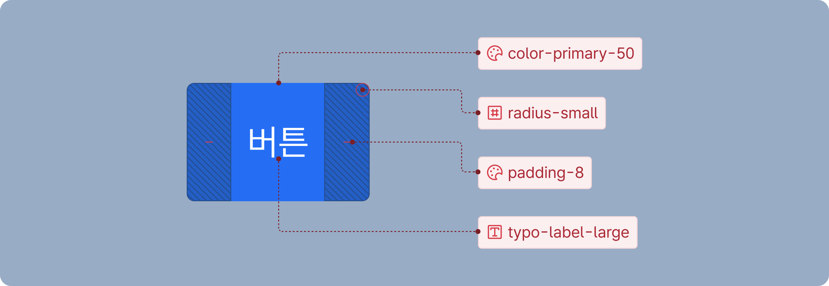
버튼 컴포넌트의 UI를 구성하기 위해 필요한 토큰은 최소 4가지입니다(디자인에 따라 더 요구될 수 있음).
- 색상 정보: 배경색, 텍스트 색상, 테두리 색상
- 보더 둥글기: 버튼 모서리의 radius 값
- 여백 정보: 내부 padding, 요소 간 gap
- 텍스트 정보: 폰트 크기, 굵기, 행간
해당 css가 선언된 변수 파일 링크는 여기 있습니다.
atlassian-light.tsx (primitive token 레벨)#
변수 설정이 되어 있는 파일입니다. primitive token 레벨에 해당된다고 볼 수 있습니다.
1html[data-theme~="shape:shape-rounder"] {
2	--ds-radius-xsmall: 0.125rem;
3	--ds-radius-small: 0.25rem;
4	--ds-radius-medium: 0.375rem;
5	--ds-radius-large: 0.75rem;
6	--ds-radius-xlarge: 1rem;
7	--ds-radius-full: 624.9375rem;
8	--ds-radius-tile: 25%;
9	--ds-border-width: 0.0625rem;
10	--ds-border-width-selected: 0.125rem;
11	--ds-border-width-focused: 0.125rem;
12}
13
14html[data-theme~="typography:typography"],
15[data-subtree-theme][data-theme~="typography:typography"] {
16	--ds-font-heading-xxlarge: normal 653 2rem/2.25rem "Atlassian Sans", ui-sans-serif, -apple-system, BlinkMacSystemFont, "Segoe UI", Ubuntu, "Helvetica Neue", sans-serif;
17	--ds-font-heading-xlarge: normal 653 1.75rem/2rem "Atlassian Sans", ui-sans-serif, -apple-system, BlinkMacSystemFont, "Segoe UI", Ubuntu, "Helvetica Neue", sans-serif;
18	--ds-font-heading-large: normal 653 1.5rem/1.75rem "Atlassian Sans", ui-sans-serif, -apple-system, BlinkMacSystemFont, "Segoe UI", Ubuntu, "Helvetica Neue", sans-serif;
19	--ds-font-heading-medium: normal 653 1.25rem/1.5rem "Atlassian Sans", ui-sans-serif, -apple-system, BlinkMacSystemFont, "Segoe UI", Ubuntu, "Helvetica Neue", sans-serif;
20	--ds-font-heading-small: normal 653 1rem/1.25rem "Atlassian Sans", ui-sans-serif, -apple-system, BlinkMacSystemFont, "Segoe UI", Ubuntu, "Helvetica Neue", sans-serif;
21	--ds-font-heading-xsmall: normal 653 0.875rem/1.25rem "Atlassian Sans", ui-sans-serif, -apple-system, BlinkMacSystemFont, "Segoe UI", Ubuntu, "Helvetica Neue", sans-serif;
22	--ds-font-heading-xxsmall: normal 653 0.75rem/1rem "Atlassian Sans", ui-sans-serif, -apple-system, BlinkMacSystemFont, "Segoe UI", Ubuntu, "Helvetica Neue", sans-serif;
23	...생략
24}
25
26html[data-theme~="spacing:spacing"],
27[data-subtree-theme][data-theme~="spacing:spacing"] {
28	--ds-space-0: 0rem;
29	--ds-space-025: 0.125rem;
30	--ds-space-050: 0.25rem;
31	--ds-space-075: 0.375rem;
32	--ds-space-100: 0.5rem;
33	--ds-space-150: 0.75rem;
34	--ds-space-200: 1rem;
35  ...생략
36}
37
38html[data-color-mode="light"][data-theme~="light:light"],
39[data-subtree-theme][data-color-mode="light"][data-theme~="light:light"],
40html[data-color-mode="dark"][data-theme~="dark:light"],
41[data-subtree-theme][data-color-mode="dark"][data-theme~="dark:light"] {
42	color-scheme: light;
43	--ds-text: #292A2E;
44	--ds-text-accent-lime: #4C6B1F;
45	--ds-text-accent-lime-bolder: #37471F;
46	--ds-text-accent-red: #AE2E24;
47	--ds-text-accent-red-bolder: #5D1F1A;
48	--ds-text-accent-orange: #9E4C00;
49	--ds-text-accent-orange-bolder: #693200;
50	--ds-text-accent-yellow: #7F5F01;
51	--ds-text-accent-yellow-bolder: #533F04;
52	--ds-text-accent-green: #216E4E;
53	...생략
54}
55
56html[data-color-mode="light"][data-theme~="light:dark"],
57[data-subtree-theme][data-color-mode="light"][data-theme~="light:dark"],
58html[data-color-mode="dark"][data-theme~="dark:dark"],
59[data-subtree-theme][data-color-mode="dark"][data-theme~="dark:dark"] {
60	color-scheme: dark;
61	--ds-text: #CECFD2;
62	--ds-text-accent-lime: #B3DF72;
63	--ds-text-accent-lime-bolder: #D3F1A7;
64	--ds-text-accent-red: #FD9891;
65	--ds-text-accent-red-bolder: #FFD5D2;
66	--ds-text-accent-orange: #FBC828;
67	--ds-text-accent-orange-bolder: #FCE4A6;
68	--ds-text-accent-yellow: #EED12B;
69	--ds-text-accent-yellow-bolder: #F5E989;
70	--ds-text-accent-green: #7EE2B8;
71	...생략
72}
디자인 시스템 가이드에서는 변수를 선언한 rawValue의 사용을 금지하고 있습니다. 이를 이제 선언한 css 변수명들을 다시 한번 감싸주어 시맨틱 토큰 레벨에 해당되는 객체를 생성합니다.
token-names.tsx (semantic token 레벨)#
1const tokens = {
2	'color.text': '--ds-text',
3	'color.text.accent.lime': '--ds-text-accent-lime',
4	'color.text.accent.lime.bolder': '--ds-text-accent-lime-bolder',
5	'color.text.accent.red': '--ds-text-accent-red',
6	'color.text.accent.red.bolder': '--ds-text-accent-red-bolder',
7	'color.text.accent.orange': '--ds-text-accent-orange',
8	'color.text.accent.orange.bolder': '--ds-text-accent-orange-bolder',
9  ...생략
10}
11
12export type CSSTokenMap = {
13	'color.text': 'var(--ds-text)';
14	'color.text.accent.lime': 'var(--ds-text-accent-lime)';
15	'color.text.accent.lime.bolder': 'var(--ds-text-accent-lime-bolder)';
16	'color.text.accent.red': 'var(--ds-text-accent-red)';
17	'color.text.accent.red.bolder': 'var(--ds-text-accent-red-bolder)';
18	'color.text.accent.orange': 'var(--ds-text-accent-orange)';
19	'color.text.accent.orange.bolder': 'var(--ds-text-accent-orange-bolder)';
20  ...생략
21};
22
23export type CSSToken = CSSTokenMap[keyof CSSTokenMap];
이제 시맨틱 토큰까지 완성되었으니 버튼컴포넌트를 분석해보겠습니다. 버튼컴포넌트의 UI 구성정보는 위에 작성한것처럼 색상 정보, 보더 둥글기, 여백 정보, 텍스트 정보를 최소로 필요로 합니다. 이제는 해당 버튼이 어떠한 역할을 하는지 현재 상태가 어떤지에 대한 정보가 필요합니다.
기본적인 유형(Appearance)과 상태(State)는 다음과 같이 구성됩니다.
유형 (Appearance)
- Primary: 주요 액션 (페이지당 1개 권장)
- Warning: 주의가 필요한 액션
- Danger: 삭제 등 위험한 액션
- Default: 일반적인 보조 액션
- Subtle: 시각적으로 덜 강조되는 액션
상태 (State)
- Disabled: 클릭 불가능한 상태
- Selected: 토글 등에서 선택된 상태
- Loading: 비동기 작업 진행 중
여기서는 버튼을 예시로 들었지만 text를 받는 input element 같은경우 유형으로 입력값의 성공, 실패, 유효하지 못한 값 입력 등이 있을 것이고 상태로는 입력불가, hover event 등 존재할 것입니다.
이제 실제 Atlassian의 버튼 컴포넌트 코드를 살펴보겠습니다. 아래는 핵심 부분만 추출한 코드입니다.
button-based.tsx#
1const styles = cssMap({
2	base: {
3		display: 'inline-flex',
4		boxSizing: 'border-box',
5		width: 'auto',
6		maxWidth: '100%',
7		position: 'relative',
8		alignItems: 'baseline',
9		justifyContent: 'center',
10		columnGap: token('space.050'),
11		borderRadius: token('radius.small', '3px'),
12		borderWidth: 0,
13		flexShrink: 0,
14		height: '2rem',
15		font: token('font.body'),
16		fontWeight: token('font.weight.medium'),
17		paddingBlock: token('space.075'),
18		paddingInlineEnd: token('space.150'),
19		paddingInlineStart: token('space.150'),
20		textAlign: 'center',
21		transition: 'background 0.1s ease-out',
22		verticalAlign: 'middle',
23		'&::after': {
24			borderRadius: 'inherit',
25			inset: token('space.0'),
26			borderStyle: 'solid',
27			borderWidth: token('border.width'),
28			pointerEvents: 'none',
29			position: 'absolute',
30		},
31	},
32	... 생략
33});
34
35const defaultStyles = cssMap({
36	root: {
37		backgroundColor: token('color.background.neutral.subtle'),
38		color: token('color.text.subtle'),
39		'&::after': {
40			content: '""',
41			borderColor: token('color.border'),
42		},
43		'&:visited': {
44			color: token('color.text.subtle'),
45		},
46		'&:hover': {
47			color: token('color.text.subtle'),
48		},
49		'&:active': {
50			// @ts-expect-error
51			color: token('color.text.subtle'),
52		},
53		'&:focus': {
54			color: token('color.text.subtle'),
55		},
56	},
57	... 생략
58});
59
60const ButtonBase = React.forwardRef((
61	{
62		appearance: propAppearance,
63		...unsafeRest
64	}) => {
65		const appearance = propAppearance;
66		const { className: _className, css: _css, as: _as, style: _style, ...saferRest } = unsafeRest;
67
68		return (
69			<button
70				{...saferRest}
71				className={cx(
72					styles.base,
73					appearance === 'default' && defaultStyles.root,
74					...생략
75				)}
76			>
77				{children}
78			</button>
79		);
80	},
81);
82
83export default ButtonBase;
버튼 컴포넌트는 appearance prop으로 다양한 variant를 받아 해당하는 className들을 병합합니다.
여기서 눈여겨볼 점이 두 가지 있습니다.
-
cssMap: Atlassian이 자체 개발한 zero-runtime CSS 라이브러리 @compiled/react의 함수입니다. 빌드 타임에 CSS를 추출하여 런타임 오버헤드가 없습니다.
-
token 함수: 모든 스타일 값이 token() 으로 감싸져 있습니다.
1function token<T extends keyof Tokens>(path: T, fallback?: string): CSSTokenMap[T] {
2  const token: Tokens[keyof Tokens] = tokens[path];
3
4  const tokenCall = fallback ? `var(${token}, ${fallback})` : `var(${token})`;
5
6  return tokenCall as CSSTokenMap[T];
7}
token 함수의 역할은 단순합니다. 시맨틱 토큰 이름을 받아서 CSS 변수 문자열을 반환합니다.
1token('color.text.accent.orange.bolder') // -> 'var(--ds-text-accent-orange-bolder)'
이 단순한 래퍼 함수는 정말 중요합니다.
- 타입 안전성: 시맨틱 토큰 객체의 키를 TypeScript 타입으로 정의하면, 존재하지 않는 토큰을 사용할 때 컴파일 에러가 발생합니다.
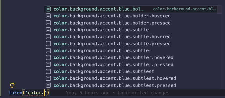
- 자동완성: 에디터에서 token('color.')까지 입력하면 사용 가능한 모든 색상 토큰이 자동완성으로 표시됩니다.
- 일관성 강제: CSS 변수를 직접 작성하는 것보다 오타 가능성이 현저히 낮아집니다.
수백 개의 토큰을 다루는 대규모 디자인 시스템에서 이 타입 안전성은 필수입니다.
결국 컴포넌트 구현의 핵심은 prop → style 매핑입니다. appearance, state, spacing 같은 prop을 받아서 해당하는 className 조합을 반환하는 것
그러고보니 위에 코드는 어딘가 정말 많이 닮았습니다.
바로 shadcn/ui의 기본 구성정보가 정말 똑같습니다.
https://ui.shadcn.com/docs/components/radix/button#
1import * as React from "react"
2import { cva, type VariantProps } from "class-variance-authority"
3import { Slot } from "radix-ui"
4import { cn } from "@/lib/utils"
5const buttonVariants = cva(
6  "focus-visible:border-ring focus-visible:ring-ring/50 aria-invalid:ring-destructive/20 dark:aria-invalid:ring-destructive/40 aria-invalid:border-destructive dark:aria-invalid:border-destructive/50 rounded-lg border border-transparent bg-clip-padding text-sm font-medium focus-visible:ring-3 aria-invalid:ring-3 [&_svg:not([class*='size-'])]:size-4 inline-flex items-center justify-center whitespace-nowrap transition-all disabled:pointer-events-none disabled:opacity-50 [&_svg]:pointer-events-none shrink-0 [&_svg]:shrink-0 outline-none group/button select-none",
7  {
8    variants: {
9      variant: {
10        default: "bg-primary text-primary-foreground [a]:hover:bg-primary/80",
11        outline: "border-border bg-background hover:bg-muted hover:text-foreground dark:bg-input/30 dark:border-input dark:hover:bg-input/50 aria-expanded:bg-muted aria-expanded:text-foreground",
12        secondary: "bg-secondary text-secondary-foreground hover:bg-secondary/80 aria-expanded:bg-secondary aria-expanded:text-secondary-foreground",
13        ghost: "hover:bg-muted hover:text-foreground dark:hover:bg-muted/50 aria-expanded:bg-muted aria-expanded:text-foreground",
14        destructive: "bg-destructive/10 hover:bg-destructive/20 focus-visible:ring-destructive/20 dark:focus-visible:ring-destructive/40 dark:bg-destructive/20 text-destructive focus-visible:border-destructive/40 dark:hover:bg-destructive/30",
15        link: "text-primary underline-offset-4 hover:underline",
16      },
17      size: {
18        default: "h-8 gap-1.5 px-2.5 has-data-[icon=inline-end]:pr-2 has-data-[icon=inline-start]:pl-2",
19        xs: "h-6 gap-1 rounded-[min(var(--radius-md),10px)] px-2 text-xs in-data-[slot=button-group]:rounded-lg has-data-[icon=inline-end]:pr-1.5 has-data-[icon=inline-start]:pl-1.5 [&_svg:not([class*='size-'])]:size-3",
20        sm: "h-7 gap-1 rounded-[min(var(--radius-md),12px)] px-2.5 text-[0.8rem] in-data-[slot=button-group]:rounded-lg has-data-[icon=inline-end]:pr-1.5 has-data-[icon=inline-start]:pl-1.5 [&_svg:not([class*='size-'])]:size-3.5",
21        lg: "h-9 gap-1.5 px-2.5 has-data-[icon=inline-end]:pr-3 has-data-[icon=inline-start]:pl-3",
22        icon: "size-8",
23        "icon-xs": "size-6 rounded-[min(var(--radius-md),10px)] in-data-[slot=button-group]:rounded-lg [&_svg:not([class*='size-'])]:size-3",
24        "icon-sm": "size-7 rounded-[min(var(--radius-md),12px)] in-data-[slot=button-group]:rounded-lg",
25        "icon-lg": "size-9",
26      },
27    },
28    defaultVariants: {
29      variant: "default",
30      size: "default",
31    },
32  }
33)
34
35function Button({
36  className,
37  variant = "default",
38  size = "default",
39  asChild = false,
40  ...props
41}) {
42  return (
43    <button
44      data-slot="button"
45      data-variant={variant}
46      data-size={size}
47      className={cn(buttonVariants({ variant, size, className }))}
48      {...props}
49    />
50  )
51}
shadcn/ui는 cva + tailwind 조합으로 버튼을 구성한다는 점을 제외하고는 메인 컨셉은 똑같습니다. 결국 props의 조합으로 스타일 조합의 반환입니다.
버튼 만들기#
이론은 충분합니다. 이제 직접 버튼을 만들어 보겠습니다.
기술 스택 선택:
- @compiled/react는 zero runtime css의 특성상 번들러의 추가 설정이 필요하고 번거롭습니다.
- Tailwind CSS + CVA(Class Variance Authority) 조합을 사용합니다. 이 조합은 이미 많은 프로젝트에서 검증되었고, 설정이 간단합니다.
목표는 단순히 shadcn/ui를 복제하는 것이 아닙니다. 타입 안전한 token 함수를 통해 디자인 토큰의 이점을 살리면서, Tailwind의 생산성을 함께 가져가는 것입니다.
먼저 primitive token 레벨을 지정해줍니다. 이는 atlassian-light.tsx파일을 css에 옮긴 것에 불과합니다.
index.css (primitive token 레벨)#
1html[data-theme~="shape:shape-rounder"] {
2	--ds-radius-xsmall: 0.125rem;
3	--ds-radius-small: 0.25rem;
4}
5
6html[data-theme~="typography:typography"],
7[data-subtree-theme][data-theme~="typography:typography"] {
8	--ds-font-heading-xxlarge: normal 653 2rem/2.25rem "Atlassian Sans", ui-sans-serif, -apple-system, BlinkMacSystemFont, "Segoe UI", Ubuntu, "Helvetica Neue", sans-serif;
9	--ds-font-heading-xlarge: normal 653 1.75rem/2rem "Atlassian Sans", ui-sans-serif, -apple-system, BlinkMacSystemFont, "Segoe UI", Ubuntu, "Helvetica Neue", sans-serif;
10	...생략
11}
12
13html[data-theme~="spacing:spacing"],
14[data-subtree-theme][data-theme~="spacing:spacing"] {
15	--ds-space-0: 0rem;
16	--ds-space-025: 0.125rem;
17  ...생략
18}
19
20html[data-color-mode="light"][data-theme~="light:light"],
21[data-subtree-theme][data-color-mode="light"][data-theme~="light:light"],
22html[data-color-mode="dark"][data-theme~="dark:light"],
23[data-subtree-theme][data-color-mode="dark"][data-theme~="dark:light"] {
24	color-scheme: light;
25	--ds-text: #292A2E;
26	--ds-text-accent-lime: #4C6B1F;
27	...생략
28}
29
30html[data-color-mode="light"][data-theme~="light:dark"],
31[data-subtree-theme][data-color-mode="light"][data-theme~="light:dark"],
32html[data-color-mode="dark"][data-theme~="dark:dark"],
33[data-subtree-theme][data-color-mode="dark"][data-theme~="dark:dark"] {
34	color-scheme: dark;
35	--ds-text: #CECFD2;
36	--ds-text-accent-lime: #B3DF72;
37	...생략
38}
tokens.json (semantic token 레벨)#
semantic token 레벨의 객체를 json으로 만들어 줍니다.
1{
2  "color.text": "--ds-text",
3  "color.text.accent.lime": "--ds-text-accent-lime",
4  "color.text.accent.lime.bolder": "--ds-text-accent-lime-bolder",
5  "color.text.accent.red": "--ds-text-accent-red",
6  "color.text.accent.red.bolder": "--ds-text-accent-red-bolder",
7  "color.text.accent.orange": "--ds-text-accent-orange",
8	...생략
9}
button.tsx#
1import { cva } from 'class-variance-authority';
2import {
3  forwardRef,
4  type PropsWithChildren,
5  type ComponentType,
6  type SVGProps as ReactSVGProps,
7  type ComponentPropsWithoutRef,
8} from 'react';
9import { token, rawToken } from '@/utils/token';
10import { cn } from '@/utils/cn';
11import Spinner from '@atlaskit/spinner';
12
13const buttonVariants = cva(
14  [
15    // layout
16    'inline-flex',
17    'box-border',
18    'w-auto',
19    'max-w-full',
20    'relative',
21    'items-baseline',
22    'justify-center',
23    'shrink-0',
24    // spacing
25    token('gap', 'space.050'),
26    // border
27    token('rounded', 'radius.small'),
28    // sizing
29    'h-8',
30    // typography
31    `[font-weight:${rawToken('font.weight.medium')}]`,
32    // padding
33    token('py', 'space.075'),
34    token('px', 'space.150'),
35    // alignment
36    'text-center',
37    'align-middle',
38    // interaction
39    'cursor-pointer',
40    'transition-[background]',
41    'duration-100',
42    'ease-out',
43    // ::after pseudo element
44    'after:rounded-[inherit]',
45    token('after:inset', 'space.0'),
46    'after:border-solid',
47    `after:border-[length:${rawToken('border.width')}]`,
48    'after:border-transparent',
49    'after:pointer-events-none',
50    'after:absolute',
51    `after:content-['']`,
52  ],
53  {
54    variants: {
55      appearance: {
56        default: [
57          // root
58          token('bg', 'color.background.neutral.subtle'),
59          token('text', 'color.text.subtle'),
60          'border',
61          token('border', 'color.border'),
62          // states
63          token('visited:text', 'color.text.subtle'),
64          token('hover:text', 'color.text.subtle'),
65          token('active:text', 'color.text.subtle'),
66          token('focus:text', 'color.text.subtle'),
67          // interactive
68          token('hover:bg', 'color.background.neutral.subtle.hovered'),
69          token('active:bg', 'color.background.neutral.subtle.pressed'),
70        ],
71        primary: [
72          // root
73          token('bg', 'color.background.brand.bold'),
74          token('text', 'color.text.inverse'),
75          // states
76          token('visited:text', 'color.text.inverse'),
77          token('hover:text', 'color.text.inverse'),
78          token('active:text', 'color.text.inverse'),
79          token('focus:text', 'color.text.inverse'),
80          // interactive
81          token('hover:bg', 'color.background.brand.bold.hovered'),
82          token('active:bg', 'color.background.brand.bold.pressed'),
83        ],
84        warning: [
85          // root
86          token('bg', 'color.background.warning.bold'),
87          token('text', 'color.text.warning.inverse'),
88          // states
89          token('visited:text', 'color.text.warning.inverse'),
90          token('hover:text', 'color.text.warning.inverse'),
91          token('active:text', 'color.text.warning.inverse'),
92          token('focus:text', 'color.text.warning.inverse'),
93          // interactive
94          token('hover:bg', 'color.background.warning.bold.hovered'),
95          token('active:bg', 'color.background.warning.bold.pressed'),
96        ],
97        danger: [
98          // root
99          token('bg', 'color.background.danger.bold'),
100          token('text', 'color.text.inverse'),
101          // states
102          token('visited:text', 'color.text.inverse'),
103          token('hover:text', 'color.text.inverse'),
104          token('active:text', 'color.text.inverse'),
105          token('focus:text', 'color.text.inverse'),
106          // interactive
107          token('hover:bg', 'color.background.danger.bold.hovered'),
108          token('active:bg', 'color.background.danger.bold.pressed'),
109        ],
110        discovery: [
111          // root
112          token('bg', 'color.background.discovery.bold'),
113          token('text', 'color.text.inverse'),
114          // states
115          token('visited:text', 'color.text.inverse'),
116          token('hover:text', 'color.text.inverse'),
117          token('active:text', 'color.text.inverse'),
118          token('focus:text', 'color.text.inverse'),
119          // interactive
120          token('hover:bg', 'color.background.discovery.bold.hovered'),
121          token('active:bg', 'color.background.discovery.bold.pressed'),
122        ],
123        subtle: [
124          // root
125          'bg-transparent',
126          token('text', 'color.text.subtle'),
127          // states
128          token('visited:text', 'color.text.subtle'),
129          token('hover:text', 'color.text.subtle'),
130          token('active:text', 'color.text.subtle'),
131          token('focus:text', 'color.text.subtle'),
132          // interactive
133          token('hover:bg', 'color.background.neutral.subtle.hovered'),
134          token('active:bg', 'color.background.neutral.subtle.pressed'),
135        ],
136      },
137      spacing: {
138        default: '',
139        compact: [
140          token('gap-x', 'space.050'),
141          'h-6',
142          token('py', 'space.025'),
143          token('px', 'space.150'),
144          'align-middle',
145        ],
146      },
147      loading: {
148        true: [
149          'cursor-progress',
150          token('px', 'space.500'),
151        ],
152        false: '',
153      },
154      selected: {
155        true: '',
156        false: '',
157      },
158      disabled: {
159        true: [
160          'cursor-not-allowed',
161          token('text', 'color.text.disabled'),
162          token('hover:text', 'color.text.disabled'),
163          token('active:text', 'color.text.disabled'),
164          'bg-transparent',
165          'hover:bg-transparent',
166          'active:bg-transparent',
167          `after:${token('border', 'color.border.disabled')}`,
168        ],
169        false: '',
170      },
171    },
172    compoundVariants: [
173      // selected + default/primary/subtle
174      {
175        selected: true,
176        appearance: ['default', 'primary', 'subtle'],
177        class: [
178          token('bg', 'color.background.selected'),
179          token('text', 'color.text.selected'),
180          `after:${token('border', 'color.border.selected')}`,
181          token('visited:text', 'color.text.selected'),
182          token('hover:text', 'color.text.selected'),
183          token('active:text', 'color.text.selected'),
184          token('focus:text', 'color.text.selected'),
185          token('hover:bg', 'color.background.selected.hovered'),
186          token('active:bg', 'color.background.selected.pressed'),
187        ],
188      },
189      // selected + warning
190      {
191        selected: true,
192        appearance: 'warning',
193        class: [
194          token('bg', 'color.background.selected'),
195          token('text', 'color.text.selected'),
196          token('hover:text', 'color.text.selected'),
197          token('active:text', 'color.text.selected'),
198          token('hover:bg', 'color.background.selected'),
199          token('active:bg', 'color.background.selected'),
200        ],
201      },
202      // selected + danger
203      {
204        selected: true,
205        appearance: 'danger',
206        class: [
207          token('bg', 'color.background.selected'),
208          token('text', 'color.text.selected'),
209          token('hover:text', 'color.text.selected'),
210          token('active:text', 'color.text.selected'),
211          token('hover:bg', 'color.background.selected'),
212          token('active:bg', 'color.background.selected'),
213        ],
214      },
215      // selected + discovery
216      {
217        selected: true,
218        appearance: 'discovery',
219        class: [
220          token('bg', 'color.background.selected'),
221          token('text', 'color.text.selected'),
222          token('hover:text', 'color.text.selected'),
223          token('active:text', 'color.text.selected'),
224          token('hover:bg', 'color.background.selected'),
225          token('active:bg', 'color.background.selected'),
226        ],
227      },
228    ],
229    defaultVariants: {
230      appearance: 'default',
231      spacing: 'default',
232    },
233  }
234);
235
236type Appearance =
237  'default'
238  | 'danger'
239  | 'primary'
240  | 'subtle'
241  | 'warning'
242  | 'discovery';
243
244interface IconProp extends ReactSVGProps<SVGSVGElement> {
245  glyph?: ComponentType<{
246    'data-testid'?: string;
247    'aria-label'?: string;
248    className?: string;
249  }>;
250}
251
252type ButtonProps = PropsWithChildren & ComponentPropsWithoutRef<"button"> & {
253  iconAfter?: IconProp;
254  iconBefore?: IconProp;
255  isLoading?: boolean;
256  isSelected?: boolean;
257  isDisabled?: boolean;
258  appearance?: Appearance;
259  spacing?: 'compact' | 'default';
260  className?: string;
261};
262
263export default forwardRef<HTMLButtonElement, ButtonProps>(function Button(
264  props,
265  ref
266) {
267  const {
268    children,
269    appearance,
270    spacing,
271    isLoading,
272    isDisabled,
273    className,
274    isSelected,
275    ...rest
276  } = props;
277
278  return (
279    <button
280      ref={ref}
281      disabled={isDisabled || false}
282      className={cn(
283        buttonVariants({ appearance, spacing, loading: isLoading, disabled: isDisabled, selected: isSelected }),
284        className
285      )}
286      {...rest}
287    >
288      {!isLoading && children}
289      {isLoading && (
290        <span
291          className={cn(
292            'flex',
293            'absolute',
294            'items-center',
295            'justify-center',
296            'overflow-hidden',
297            token('inset', 'space.0'),
298          )}
299        >
300          <Spinner appearance="invert" size="medium" />
301        </span>
302      )}
303    </button>
304  );
305});
여기서 token함수를 둘로 나누었습니다. rawToken함수는 그대로 semantic token 값을 넣으면 primitive token 문자열을 반환하는 함수입니다. token 함수는 tailwind 문법에 맞춰 동적으로 클래스 이름을 지정하기 위한 함수입니다.
token.ts#
1import tokens from './tokens.json';
2
3// TypeScript 타입 생성
4type TokenKeys = keyof typeof tokens;
5
6export type CSSTokenMap = {
7  [K in TokenKeys]: `var(${(typeof tokens)[K]})`;
8};
9
10export type CSSToken = CSSTokenMap[keyof CSSTokenMap];
11
12const CSS_PREFIX = 'ds';
13const TOKEN_NOT_FOUND_CSS_VAR: '--ds-token-not-found' = `--${CSS_PREFIX}-token-not-found`;
14
15type Tokens = typeof tokens;
16
17export function rawToken<T extends keyof Tokens>(path: T, fallback?: string): CSSTokenMap[T] {
18  let token: Tokens[keyof Tokens] | typeof TOKEN_NOT_FOUND_CSS_VAR = tokens[path];
19
20  if (!token) {
21    token = TOKEN_NOT_FOUND_CSS_VAR;
22  }
23
24  const tokenCall = fallback ? `var(${token}, ${fallback})` : `var(${token})`;
25
26  return tokenCall as CSSTokenMap[T];
27}
28
29export function token<T extends keyof Tokens>(property: string, path: T, fallback?: string) {
30  return `${property}-[${rawToken(path, fallback)}]`;
31}
token 함수의 사용 예시입니다.
1// rawToken: CSS 변수 문자열만 반환
2rawToken('font.weight.medium')
3// -> 'var(--ds-font-weight-medium)'
4
5// token: Tailwind 클래스 형태로 반환
6token('bg', 'color.background.neutral.subtle')
7// -> 'bg-[var(--ds-background-neutral-subtle)]'
8
9token('hover:bg', 'color.background.neutral.subtle.hovered')
10// -> 'hover:bg-[var(--ds-background-neutral-subtle-hovered)]'
이 접근 방식의 장점은 Tailwind의 모든 modifier를 그대로 사용할 수 있다는 것입니다. hover:, active:, focus:, after: 등의 pseudo-class/element를 첫 번째 인자에 포함시키면 됩니다.
여기서 Tailwind의 추가 설정이 필요합니다. token 함수는 런타임에서 실행됩니다. Tailwind JIT는 빌드타임에 정적 문자열만을 스캔하므로 token 함수의 반환값을 인식하지 못합니다. 이 문제를 해결하기 위해 Safelist를 사용하여 빌드타임에 Tailwind에게 생성할 클래스 이름을 명시적으로 지정해야 합니다.
주의: Safelist는 번들 크기를 증가시킬 수 있습니다. 프로덕션 환경에서는 실제 사용되는 토큰만 포함하도록 필터링하거나, 빌드 스크립트에서 정적 분석을 통해 사용 중인 토큰만 추출하는 방식을 고려해볼 수 있습니다.
tailwind.config.js#
1/** @type {import('tailwindcss').Config} */
2import tokens from './src/utils/tokens.json' with { type: 'json' };
3
4// safelist 생성
5const colorProps = ['bg', 'text', 'border', 'hover:bg', 'hover:text', 'hover:border', 'active:bg', 'active:text', 'active:border', 'focus:text', 'visited:text', 'after:border'];
6const spacingProps = ['p', 'px', 'py', 'pt', 'pr', 'pb', 'pl', 'm', 'mx', 'my', 'gap', 'inset', 'after:inset'];
7const radiusProps = ['rounded'];
8
9const safelist = [];
10
11Object.entries(tokens).forEach(([name, cssVar]) => {
12  if (name.startsWith('color.') || name.startsWith('elevation.surface')) {
13    colorProps.forEach(prop => safelist.push(`${prop}-[var(${cssVar})]`));
14  }
15  if (name.startsWith('space.')) {
16    spacingProps.forEach(prop => safelist.push(`${prop}-[var(${cssVar})]`));
17  }
18  if (name.startsWith('radius.')) {
19    radiusProps.forEach(prop => safelist.push(`${prop}-[var(${cssVar})]`));
20  }
21  if (name.startsWith('font.weight.')) {
22    safelist.push(`[font-weight:var(${cssVar})]`);
23  }
24  if (name.startsWith('border.width')) {
25    safelist.push(`after:border-[length:var(${cssVar})]`);
26    safelist.push(`border-[length:var(${cssVar})]`);
27  }
28});
29
30export default {
31  content: [
32    './index.html',
33    './src/**/*.{js,ts,jsx,tsx}',
34  ],
35  safelist,
36  theme: {
37    extend: {},
38  },
39  plugins: [],
40};
결론#
디자인 시스템은 결국 **"의미 있는 이름으로 스타일을 추상화하는 것"**입니다. #0052CC라는 값 대신 color.background.brand.bold라는 토큰을 사용하면 다음과 같은 이점이 있습니다.
- 의도가 명확해집니다 - 이 색상이 "브랜드를 강조하는 배경색"임을 코드만 봐도 알 수 있습니다.
- 변경에 유연해집니다 - 브랜드 색상이 바뀌어도 토큰 정의만 수정하면 됩니다.
- 일관성이 보장됩니다 - 같은 토큰을 사용하면 항상 같은 결과를 얻습니다.
Atlassian과 shadcn/ui의 유사성이 확인됩니다.
| 구분 | Atlassian | shadcn/ui |
|---|---|---|
| CSS 솔루션 | @compiled/react (zero-runtime) | Tailwind CSS |
| 토큰 시스템 | 자체 token() 함수 | CSS Variables + Tailwind |
| 번들 영향 | 빌드타임에 CSS 추출 | JIT로 사용된 클래스만 생성 |
| 타입 안전성 | TypeScript로 토큰 자동완성 | 문자열 기반 |
shadcn/ui의 공식문서를 들어가면 The Foundation for your Design System 이라는 문구가 처음 보여집니다. 어떠한 css 라이브러리를 사용하더라도 이미 검증된 보일러 플레이트 위에 우리만의 토큰 체계를 얹는 다면 디자인 시스템 구축은 크게 어렵지 않을 것입니다.