Styling
Various theme
Various themed styles are available. Import and use them as shown below.
import 'react-strawberry-toast/dist/style2.css';
import 'react-strawberry-toast/dist/style3.css';
CSS
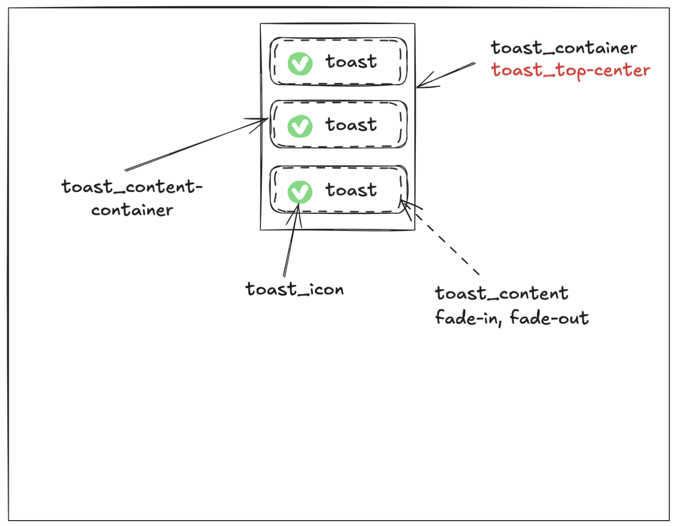
This is the CSS classes used for the react-strawberry-toast. Here is CSS file link
$react-strawberry-toast-namespace: 'react-strawberry-toast';
$offset: 16px;
$react-strawberry-toast-success: #1dca82;
$react-strawberry-toast-error: #eb2639;
$react-strawberry-toast-warn: #fcba03;

.#{$react-strawberry-toast-namespace}__z9999 {}

.#{$react-strawberry-toast-namespace}__toast-container {}

.#{$react-strawberry-toast-namespace}__top-left {}

.#{$react-strawberry-toast-namespace}__top-center {}

.#{$react-strawberry-toast-namespace}__top-right {}

.#{$react-strawberry-toast-namespace}__bottom-left {}

.#{$react-strawberry-toast-namespace}__bottom-center {}

.#{$react-strawberry-toast-namespace}__bottom-right {}

.#{$react-strawberry-toast-namespace}__toast-content-container {}

.#{$react-strawberry-toast-namespace}__toast-content {}

.#{$react-strawberry-toast-namespace}__toast-icon {}

.#{$react-strawberry-toast-namespace}__fade-in {}

.#{$react-strawberry-toast-namespace}__fade-out {}

.#{$react-strawberry-toast-namespace}__fade-in-reverse {}

.#{$react-strawberry-toast-namespace}__fade-out-reverse {}

.#{$react-strawberry-toast-namespace}__loading {}
The image below shows the class assigned to the element when the toast is displayed. The text highlighted in red is a dynamic class determined by the position of the toast.
Toast Container Styling
The <ToastContainer /> and toast function provides className and style as options.
<ToastContainer style={style} className="className" />